
Momentum
Learn new skills from experts curated courses
Online learning website with responsive design for desktop and mobile
Introduction
Learning a new skill can be both exciting and challenging. People who are interested in learning need a platform to discover new skills they would like to learn either for personal interests or professional growth. Momentum is a website designed for professional adults to explore courses they are interested in and develop their desired skills. By providing a validated platform with personalized high quality courses, Momentum provided a solution for people to learn new skills conveniently and efficiently.
Project Duration: 120 hours
My Role: End-to-end UI/UX Design, UX Research, Wireframing, Prototyping, Usability Testing
Tools: Figma, Notion, Google Docs, Zoom


Research
Research Goals

In order to create an intuitive user experience, it is important to understand users’ needs when choosing an online learning website so that we can include functions and features to optimize users’ learning experience.
Competitive Analysis
As part of the research, I compared interfaces of competitor online learning websites to see what are the common and unique features of each website and what are their strengths and weaknesses compared to each other.

User Interviews
I conducted interviews to hear from users first hand their stories of how they learn new skills and how they apply the new skills in their lives. The interviews are conducted via Zoom and recorded for analysis. I recruited 6 participants, ages 28 to 35. All of them meet the following criteria:
interested in learning and self-development
currently or recently learned a new skill
have experience using online learning websites
Topics covered in the interviews include:
Recent learning experience
New skills learned recently
Likes and dislikes in recent learning experience
Learning habits
Purpose for learning
Time for learning
How to stay motivated?
Learning independently or with peers?
Online learning preferences
Videos or articles?
University or individual expert created course?
Self-paced or strict timeline?
Reasonable price
Affinity Map

I created an affinity map to organize qualitative data collected from the interviews. I took notes of users’ insights on their online learning experience and focused on analyzing their recent learning experience, learning habits, and online learning preferences.
Key Research Insights
Most participants’ recent learning experience are technical skills.
80% of users learn new skills for purposes of career development, 20% for personal growth.
Most users spend 1-2 hours per day on learning.
Most participants prefer to learn with their peers rather than learning by themselves.
All participants prefer watching videos rather than reading articles.
Most participants like courses with a clear timeline but some flexibility.
Define

User Persona
As I analyze my research data, I identified patterns in users behaviors and created 2 user personas with different learning purposes and habits.
Meet Emily, The primary persona, who learns new skills to develop professional skills and accelerate her career.

Meet Raj, The secondary persona, who learns to fulfill his personal interests and curiosity.

Ideate

Storyboard
One of the pain points mentioned by most of the participants during my research is the lack of motivation to complete or stay on track when taking self-paced online courses. To define a solution, I created a storyboard of two scenarios of the challenge and provided two options to help users stay motivated to complete their courses on time.

Project Goals
Exploring user pain points helped me define user goals while using the service. However, a successful business model has to meet the goals of both the users and the business. The intersect of the users and business goal helped me define the goals of this project.

Feature Roadmap
With the project goals defined I went ahead to brainstorm features I would like to include on the website. I mapped out the features based on my user research and competitive analysis. I ranked the features into 4 phases based on their importance. Since the expectation of the project is to build a MVP prototype, I decided to focus on the first 2 phases of the feature roadmap.

Sitemap
With the features and project goals defined, I created a sitemap which set up the basic structure of the website. To simplify the process of exploring courses, users have the option to find a course by searching keywords or browse courses categories. Two sub-categories are provided: professional development and personal interests courses, to help users locate their desired courses more accurately.

User and Task Flows
Based on my site map, I created 2 user flows: sign in / sign up, and purchase a course. From these user flows, I identified 3 task flows: sign up as a student, find a course by searching keywords, find a course through category and check out from cart.


User Flows


Task Flows
Design

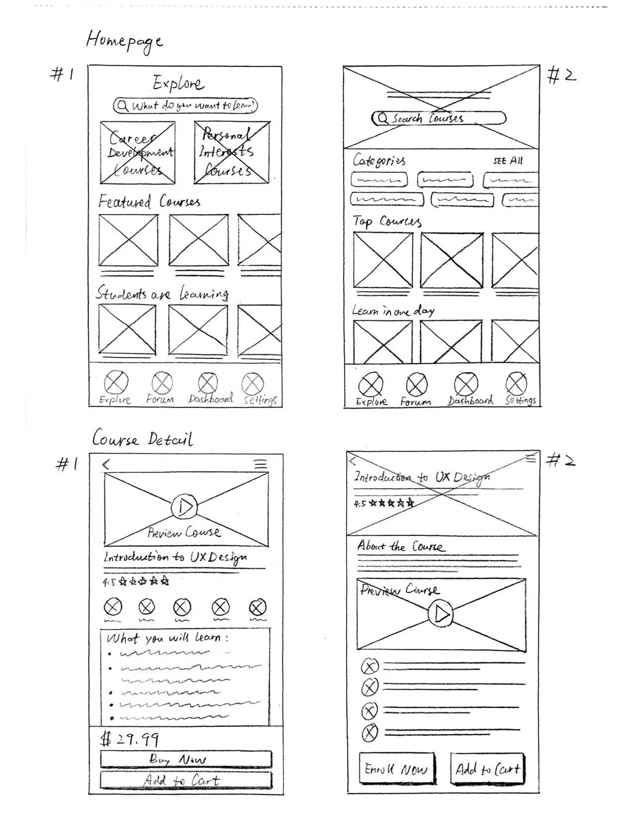
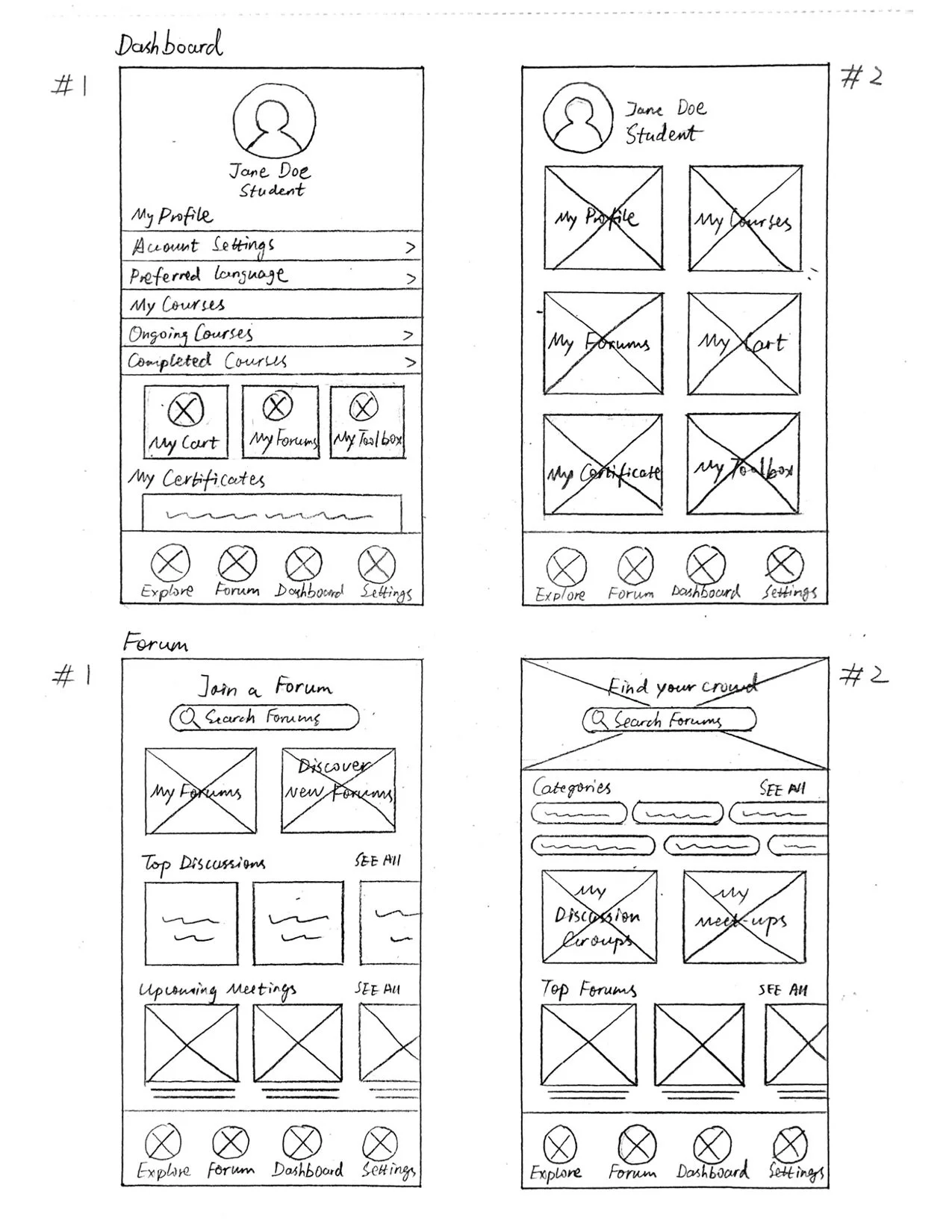
Low-Fi Wireframes
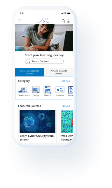
I created low-fidelity wireframes for the mobile version of the website homepage, course detail page, personal dashboard page, and forum page.
Mid-Fi Wireframes
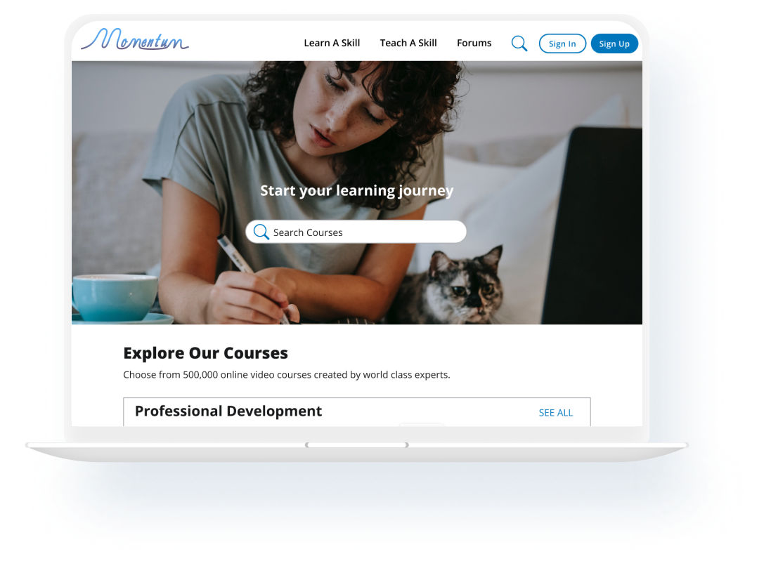
I took my low-fi wireframes for mobile design to mid-fi, and created the desktop version of mid-fi wireframes for the homepage, search result page, and course detail page. While creating the desktop version of the website, I make sure the desktop and mobile design are responsive and the user experiences are consistent on different devices.


Moodboard
Name of the brand is the core of branding. When coming up with the brand name, I want to strike users with the impression of the core value of my design. To define the value of learning for adults, the keywords that came into my mind are curiosity, professional, creativity, growth, and connection. Based on the core values, I decided to name the website Momentum, which symbolizes the continuity of self-improvement and life-long learning.

Logo
Logo design is the fun part of the project. I decided to explore creating monograms and wordmarks and sketched out a few possibilities. I referred to some learning websites for ideas of logo designs. I went into two directions for my initial design: one is technical and the other is artistic. Both directions go for a simplistic and modern look. After getting some feedback from users and design critics, I chose the wordmark as my final design for its simple and dynamic look.
UI Component library

With the mood board and logo design ready, I created the UI Component library for the high-fidelity wireframes. I chose different shades of blue as my primary color and purple as secondary color to create a simple, modern and clean look for the UI design.
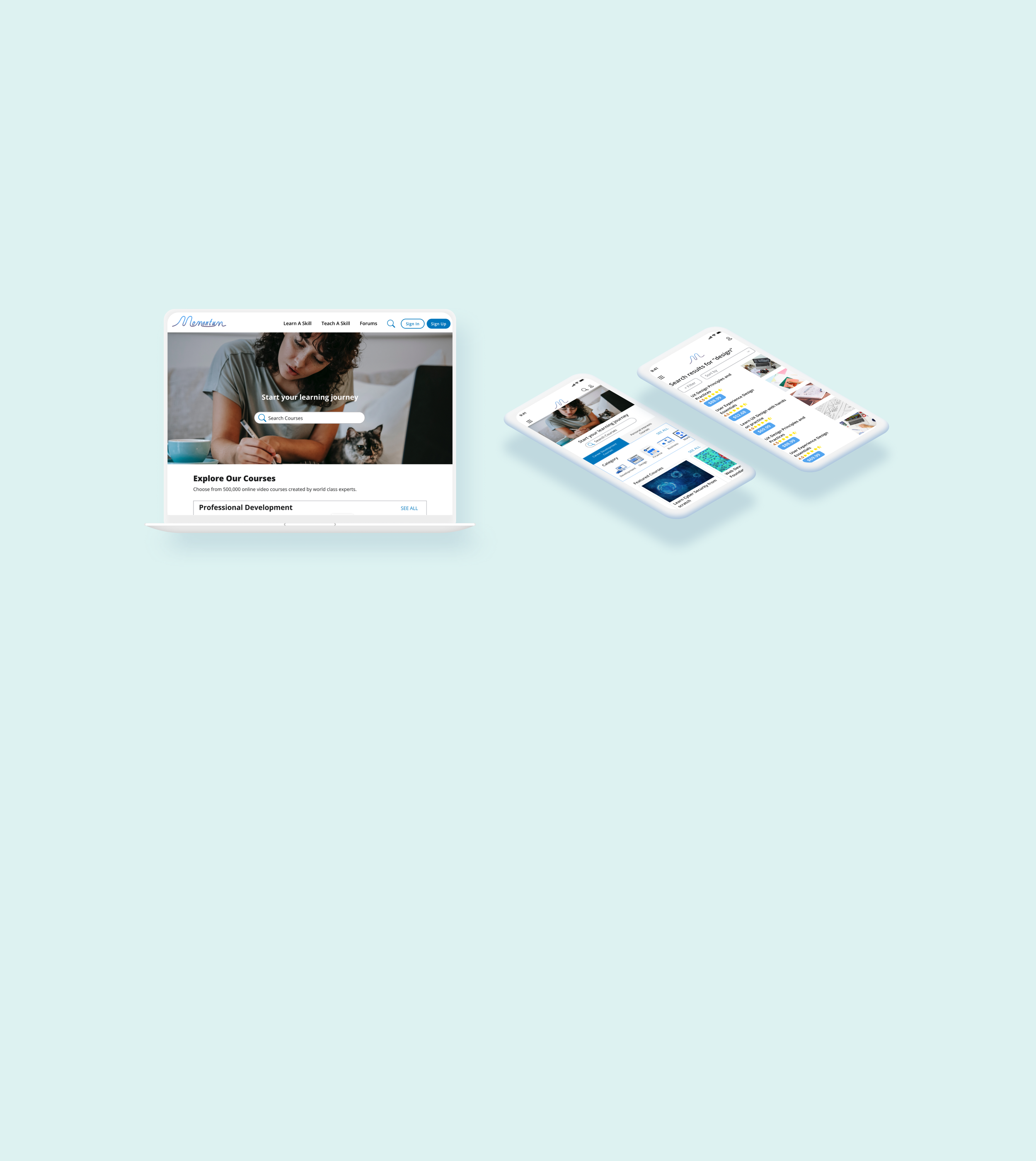
High-Fi Wireframes
I created the high-fidelity wireframes for Momentum for the user flow of finding a course by searching keywords and view course details. I created the responsive design for desktop and mobile with 3 key screens for each device. I chose to create this user flow because it appears to be one of the most important features of the website according to my user research.


Prototype
Test

Usability Testing
I conducted moderated usability testing with 5 participants whom I interviewed with during my user research. During the testings I asked participants to find a course by searching keywords and selecting a course to view course details. I used Lookback to create my tests and record participants' screens and cameras during the tests to collect data for analysis. After the tests, I replayed the recordings to take notes of how they navigate through the prototype and feedback on their experiences.
To analyze usability test results, I created an affinity map to organize feedback from users to discover patterns and prioritize areas for improvement in the iteration.
Affinity Map

Creating an affinity map helped me prioritize feedback and identify issues based on severity and frequency. I categorized issues into top, secondary, and tertiary priority iterations and iterated on the top and secondary priority issues.
Priority Iterations
Top priority iteration:
left align ratings
use gray color for instructor’s name
larger space between search bar and tabs bigger on mobile
add search bar in search result page
bigger text space in course content on mobile
simplify “about this course” description
center align mobile footer
Secondary priority iteration:
add top menu bar on mobile
make “Join membership” and “subscribe” small text consistent
add number to course content detail
smaller button for “apply filter”
smaller spacing in top navigation bar
smaller hero section picture
icon size consistency in footer
My Takeaways

First end-to-end design project
Upon finishing my very first UI/UX design project, I came a very long way from learning the fundamentals of design thinking to take on an end-to-end design project independently. Overall I am proud of the end result of this project although there are lots of areas of improvement that need further iterations.
Work with limited time
The biggest challenge I faced while working on this project is limited time. As a bootcamp project I had to put the concepts I just learned into practice during each step of the project. I wish I could have time to dive deeper and spend more time to polish my design but I had to move on with what I had in order to keep making progress. I understand time management is one of the essential skills for designers, and I will keep working on it for my future projects.
Next steps
To bring this project further, I would create a couple more task flows including managing the personal dashboard and the check out process. I would also love to spend more time on usability testing to collect more feedback and create more iterations on the design.